Cereal: Airbnb's Custom Typeface
Inspiring the global design community to care about a niche typography project.

Background
Airbnb’s visual brand is distinctly typographic. As the company scaled and its product portfolio expanded to include more print and offline touchpoints it became important to remain visually differentiated in a crowded marketplace. On the company's 10th anniversary, the Design team and Dalton Maag developed a new typeface to address this. I was tasked with developing and leading our external announcement to our US, European, and Latin-American creative community.
The challenge was how to extract global newsworthiness from a niche project. To succeed, we had to find a way to get business and creative press to see the value in amplifying our launch to the creative community despite the fact the font wouldn’t be open sourced.
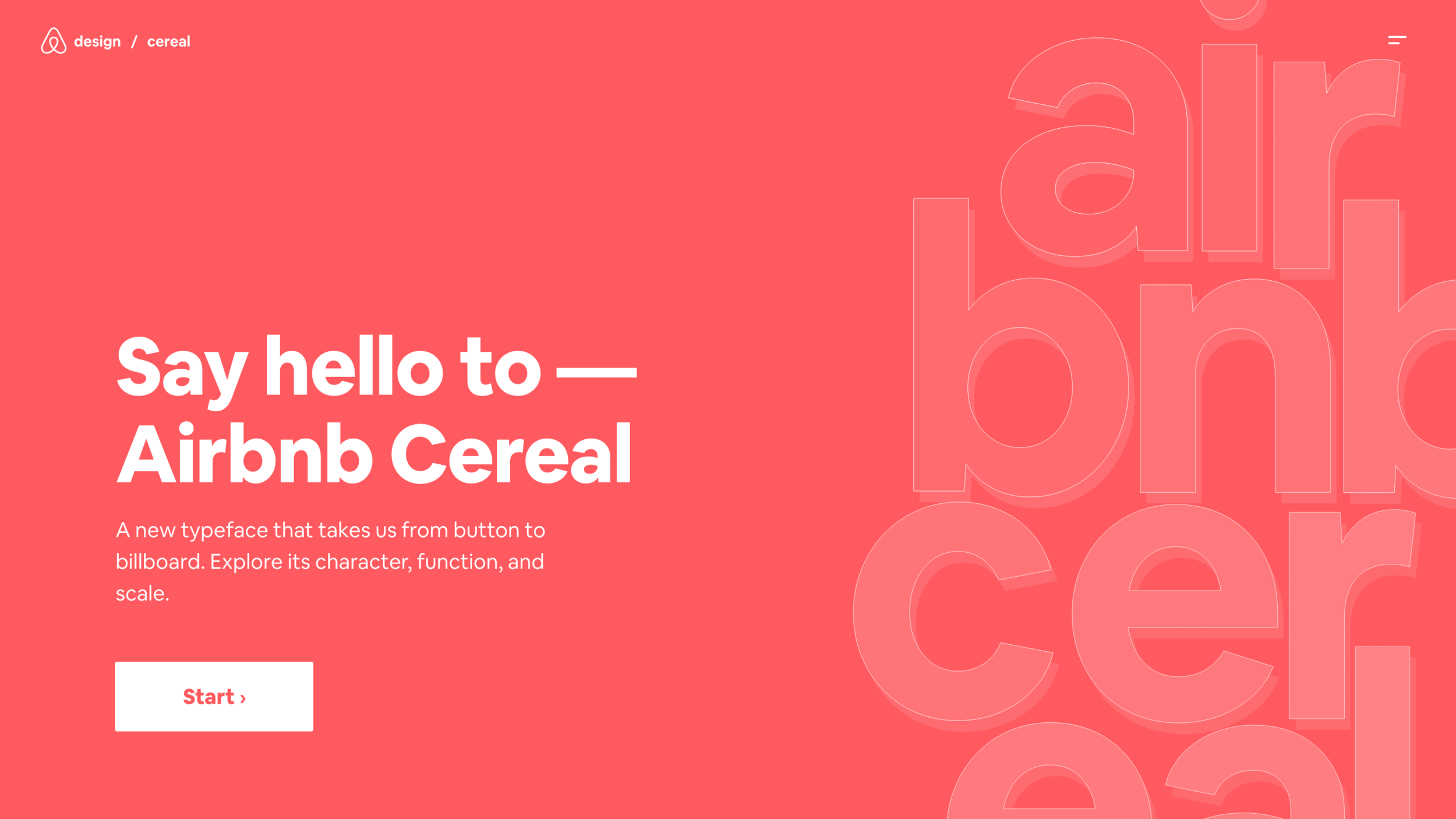
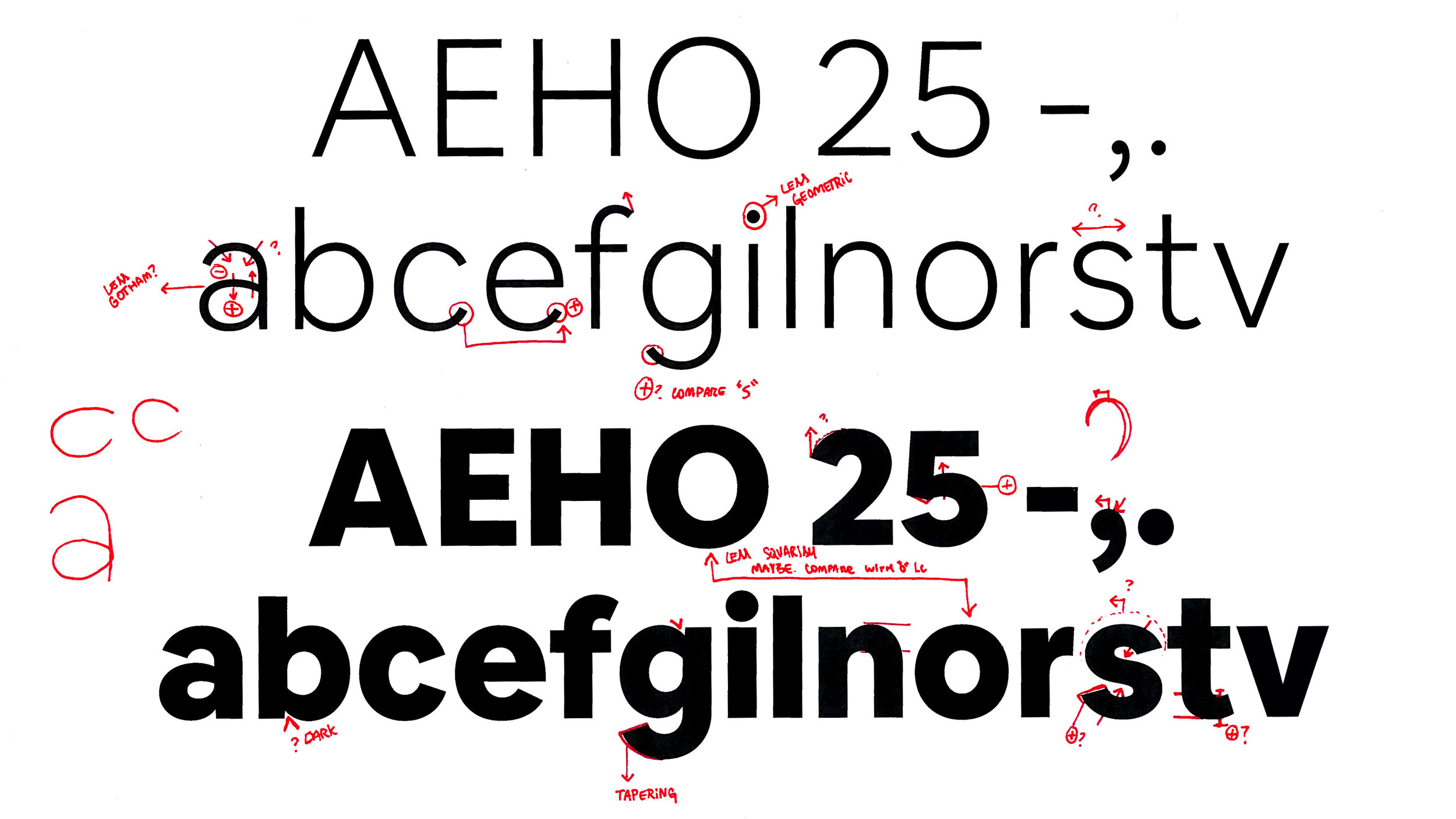
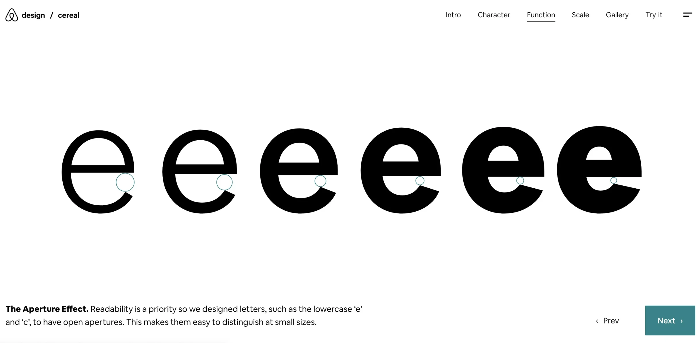
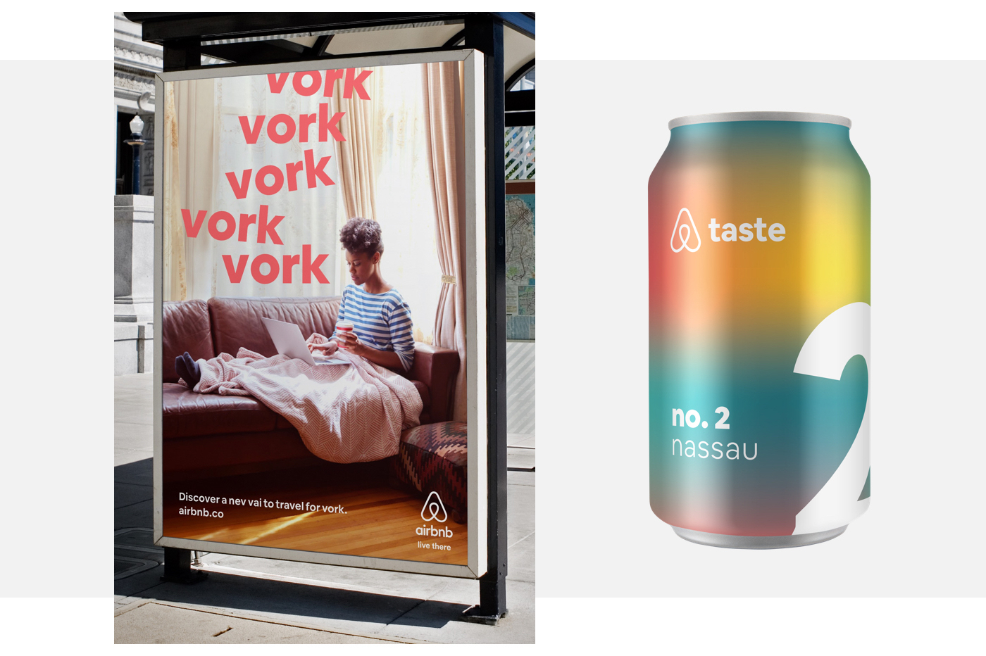
Most typefaces either work well in print or on a screen--it’s rare to find one font that can bridge the gap successfully. As a company that’s designing connected online and offline experiences, we saw a clear opportunity to create a distinct, legible, and differentiated typeface that could carry the weight of both—to leap off the screen into the pages of a magazine. This was a major differentiator and became the key insight that drove the narrative. I focused our external story on three specific business needs that the typeface was addressing: character (brand distinction), function (legibility) and scale (a typeface that could transition from an app button to a large billboard). These key messages drove all our launch narrative and corresponding creative.
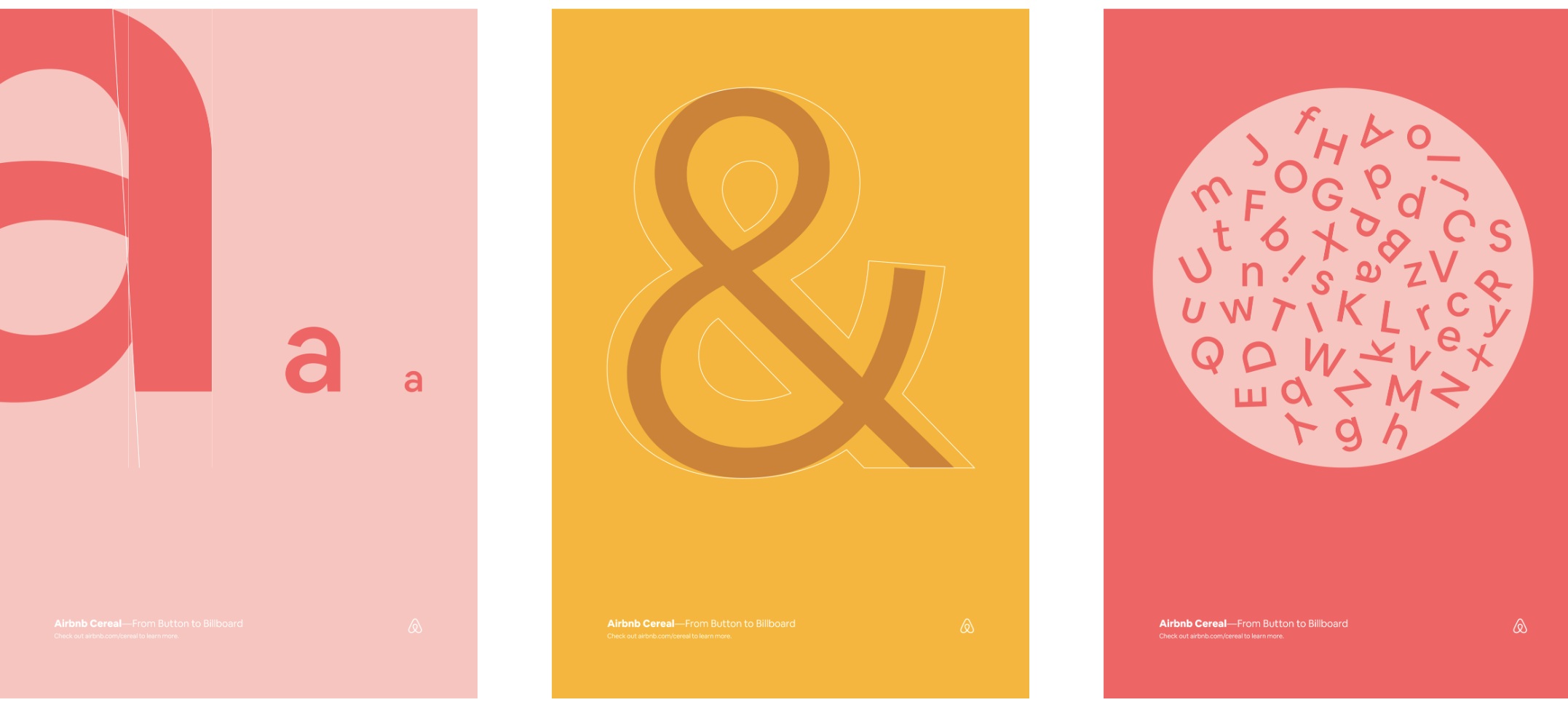
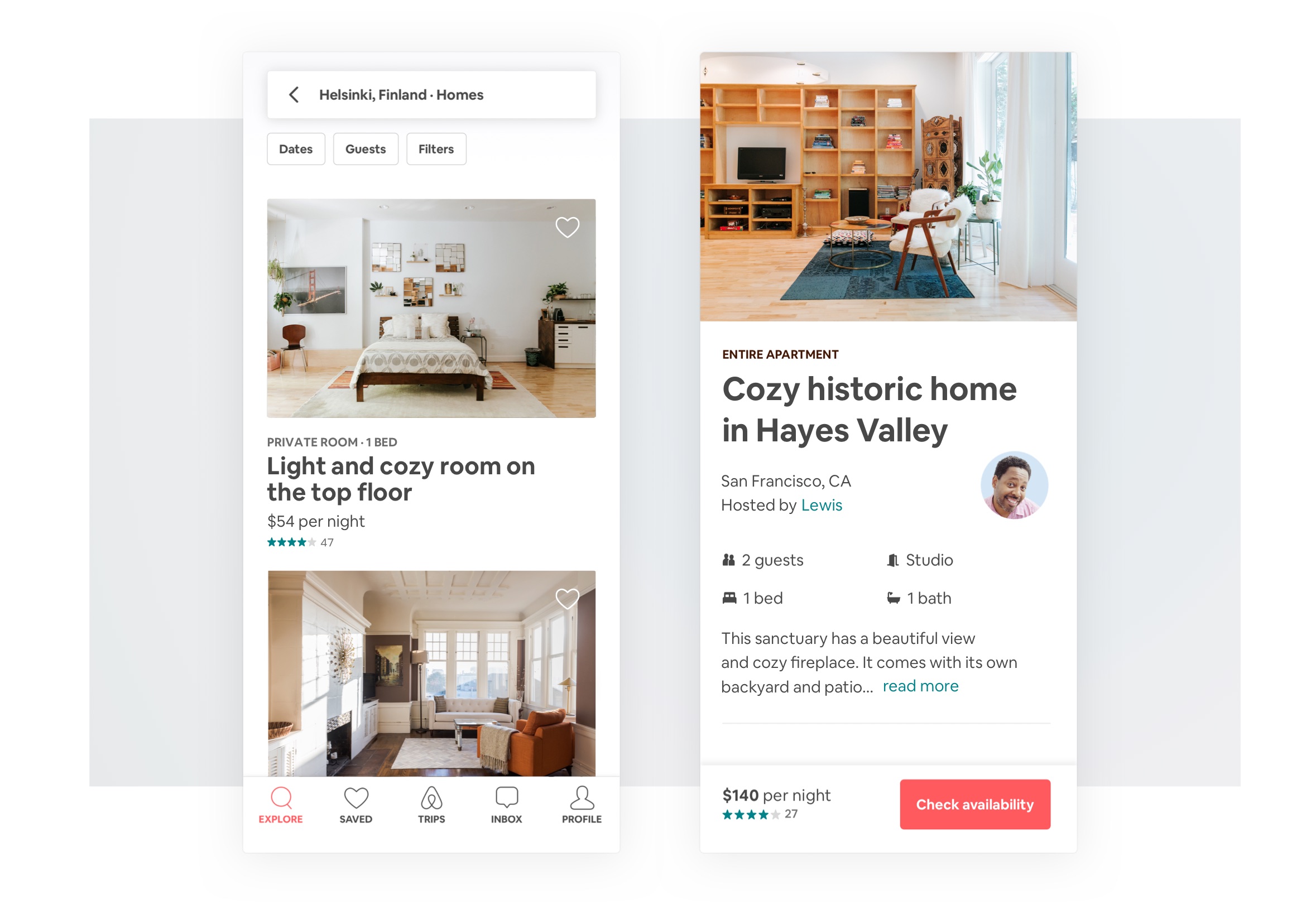
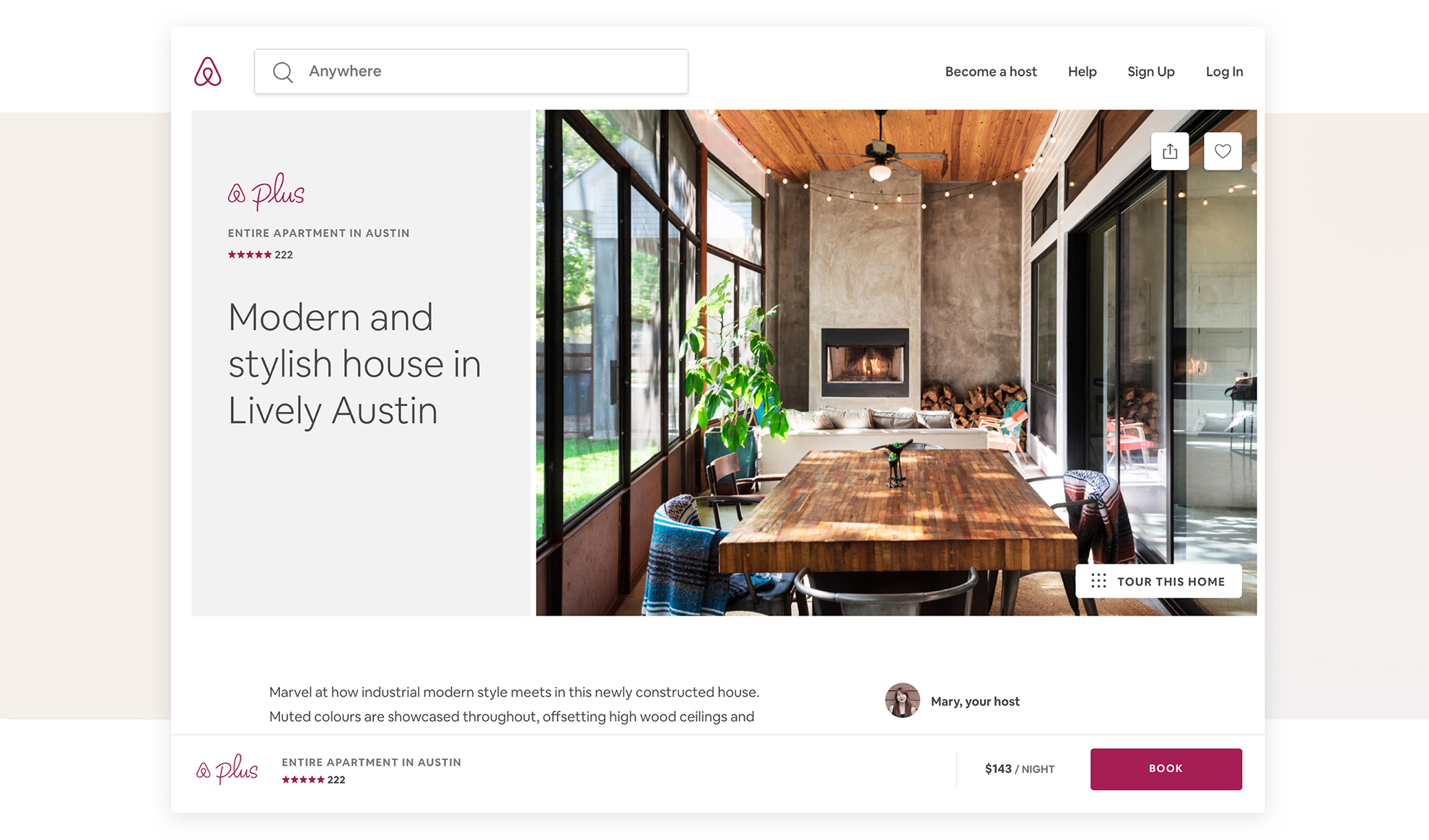
Our deliverables were a 1) a playful launch site, 2) a marketing case study, 3) a technical product case study, and 4) educational animated videos that incorporated the key messages. Dive into the Cereal website for more context into how the messages were expressed.
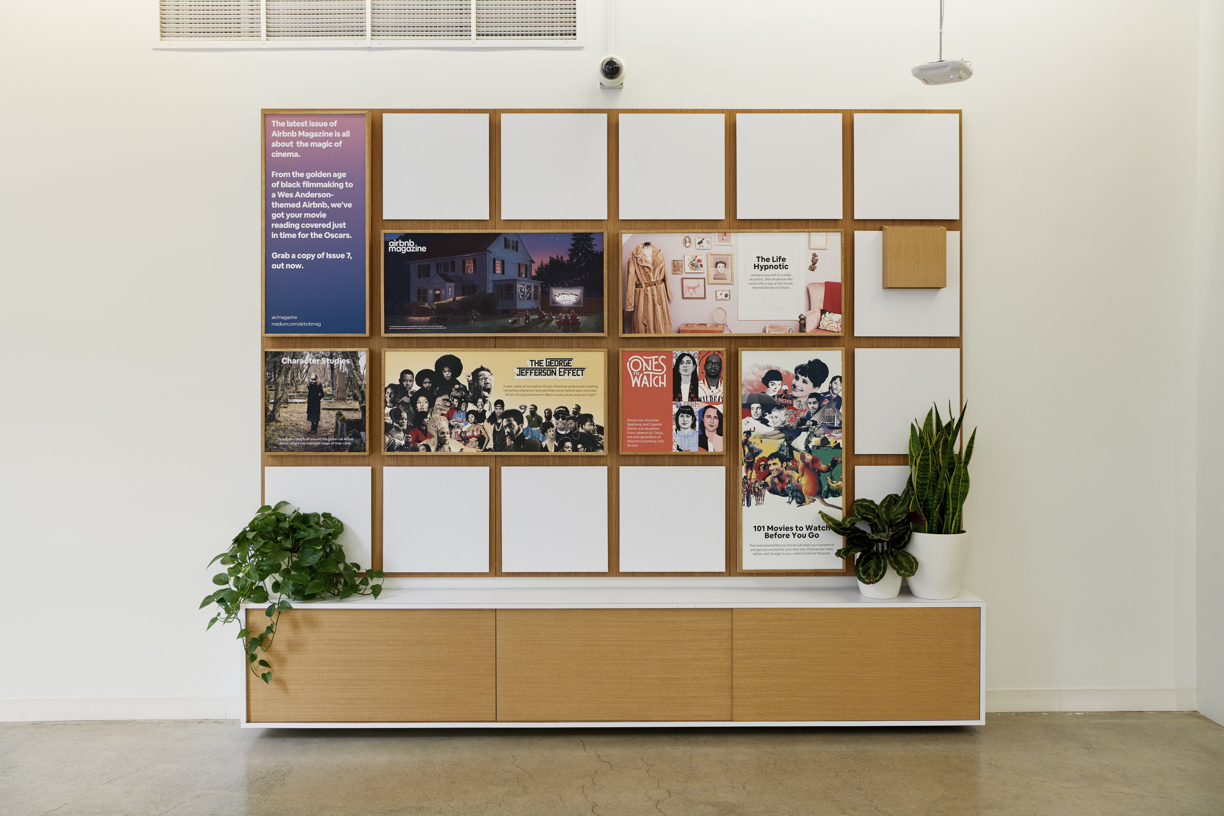
Featured below: the animated video, screenshots from the website and examples of the system applied across product and offline environments.
Airbnb Cereal educational video for press outlets.
Results
Positive press coverage across global business and design publications in America, Brazil, Germany, Italy, Japan, Russia, Spain, Sweden and the UK. Included Creative Review, Adweek, Fast Company, Dezeen, etc. We also exceeded our digital performance goals for the Cereal site (Over 1.5+ million people have viewed the website), Twitter, (280k + people watched the educational videos), Instagram, and Airbnb.Design.
Core Team /
Karri Saarinen (Cereal Design Lead), Derek Chan (Cereal Design Lead), Salih Abdul-Karim (Motion designer), Jack Hone (Designer) Ben Wilkins (Design technologist), Michael Smith (Writer-naming) and others.
My Role /
Project lead and strategist